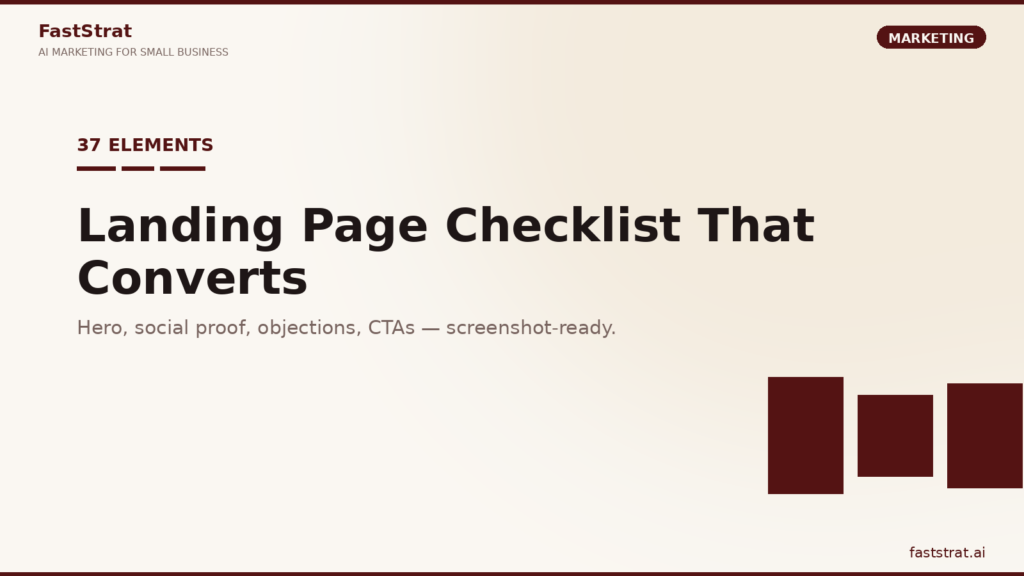
TL;DR. Unbounce’s 2024 benchmark report puts the average landing page conversion rate at 6.6% across industries, with top performers at 20%+. The gap is almost always the basics, not the creative. This checklist covers the 37 elements that show up on nearly every high-converting page, grouped into 8 categories. Use it as a shareable audit for every landing page you ship.
Every decent landing page is a sequence of small decisions. Headline, subhead, image, proof, proof, proof, feature, feature, objection, CTA. The decisions are not magic. They are catalogued. What separates a 1% conversion rate from a 10% conversion rate on the same traffic is usually not a brilliant insight, it is the cumulative weight of 37 small things done right.
This post is a shareable checklist. Bookmark it, screenshot the sections, run it against every landing page you ship. For the strategic foundation (positioning, value prop, ICP), pair it with how to write a value proposition that sells, how to write headlines that convert and how to define your ideal customer profile.
The 37 elements, grouped:
- Above the fold (7)
- Hero (5)
- Social proof (5)
- Product/feature (5)
- Objection handling (5)
- CTA (5)
- Trust (3)
- Technical (2)
Above the fold (1 to 7)
The first 600 vertical pixels do most of the work. Per Nielsen Norman Group’s scrolling research, users spend 57% of their page-viewing time above the fold. Everything below has to earn the scroll.
1. A headline that names the outcome
Why: The headline does 80% of the work of the page. It either promises an outcome the visitor wants or it does not.
Good looks like: Stripe’s “Financial infrastructure to grow your revenue” names the outcome (grow revenue) and the role (infrastructure). Not clever, clear.
Avoid: feature-speak, internal jargon, clever metaphors nobody decodes in 2 seconds.
2. A subheadline that adds specificity
Why: Your headline names the outcome, the subhead names the who/how/when. Two lines, max.
Good looks like: Linear uses subheads that specify “for product teams that ship” directly under the headline.
Avoid: repeating the headline in different words.
3. A single primary CTA visible above the fold
Why: If your most ready-to-act visitor has to scroll to convert, you lost them.
Good looks like: Shopify’s hero has “Start free trial” as the first and clearest button above the fold.
Avoid: 4 buttons of similar weight.
4. A visual anchor (product shot, hero image, short loop)
Why: Abstract pages underperform pages that show the thing. Even B2B pages benefit from a product UI screenshot or a short product loop.
Good looks like: Notion’s hero screenshots show the actual product UI the user will see.
Avoid: stock photos of people in headsets.
5. A trust strip (logos, rating, count)
Why: Immediate social validation before the visitor reads anything below.
Good looks like: “Used by 20,000+ teams” or a row of 5 recognizable customer logos.
Avoid: fabricated logos or unrecognizable ones that add nothing.
6. Zero navigation temptation (for paid traffic)
Why: On a dedicated landing page for a paid campaign, the top nav is a leak. Remove it or minimize to logo + CTA.
Good looks like: most Google Ads destination pages on SaaS sites strip the nav.
Avoid: dragging your full site nav onto a conversion-focused page.
7. Page loads in under 2.5 seconds (LCP)
Why: Per Google’s Core Web Vitals thresholds, LCP above 2.5s is “needs improvement” and correlates with higher bounce. Every second over 3 is measurable lost conversion.
Good looks like: PageSpeed Insights mobile score above 80.
Avoid: 4MB hero images, 12 blocking scripts.
Hero (8 to 12)
The hero section is the first screen plus the first scroll. It has to answer three questions: what is this, who is it for, why should I care.
8. A specific target-persona reference
Why: “For busy parents”, “for B2B SaaS founders”, “for independent plumbers”. Self-qualification is a conversion lever.
Good looks like: “Project management for product teams that ship” (Linear).
Avoid: “for everyone”.
9. A one-line outcome statement
Why: Separate from the headline. States the tangible result: “Book 30% more calls”, “Cut churn in half”.
Good looks like: specific numbers beat vague promises.
Avoid: “transform your business”.
10. Secondary CTA for not-yet-ready visitors
Why: “Start free trial” is for the 5% ready to buy. “See how it works” is for the 40% still learning.
Good looks like: a clearly secondary button style next to the primary.
Avoid: making both buttons equally weighted.
11. A short proof point in the hero
Why: “Used by 20,000 teams” or “$2B in revenue managed” placed directly below the CTA.
Good looks like: one specific number, one line.
Avoid: a paragraph of corporate copy.
12. Visual hierarchy that guides the eye
Why: Size, contrast, whitespace. The visitor’s eye should travel: headline to subhead to CTA to visual, in that order.
Good looks like: clear focal point, nothing competing.
Avoid: 4 competing visual elements of similar weight.
Social proof (13 to 17)
Social proof is the single largest conversion lever after the headline. Per BrightLocal’s consumer review research, 87% of consumers read online reviews before buying. On a landing page, proof is not optional, it is structural.
13. Customer logos (5 to 8)
Why: Pattern recognition. “If these brands use it, it is legit.”
Good looks like: grayscale logos in a clean row, with aspect ratios normalized.
Avoid: 30 logos crammed onto one row, or made-up ones.
14. Testimonials with face, name, role, company
Why: Attribution is everything. “Jane D., Marketing Director, Acme” is credible. “J.D., Happy Customer” is not.
Good looks like: photo + full name + specific role + recognizable company.
Avoid: anonymous quotes.
15. Specific outcome numbers in testimonials
Why: “Saved us 12 hours a week” beats “great product, would recommend”.
Good looks like: a specific, verifiable number.
Avoid: generic praise.
16. Case studies with context and metrics
Why: Full-length proof for high-consideration buyers who need the story. Not on every landing page, but on every B2B or high-ticket page.
Good looks like: “From 2% to 9% trial-to-paid conversion in 90 days” with a short narrative.
Avoid: case studies with no metric.
17. Ratings and review aggregates
Why: “4.8 stars, 2,400 reviews on G2” is a shortcut for trust.
Good looks like: linked to the actual review source, with visible count.
Avoid: unverifiable star ratings.
Product/feature (18 to 22)
Features are not the star of the page, but they are necessary. Buyers need to verify the product can actually do what the headline promised.
18. Benefit-led section headlines
Why: Your H2s should name outcomes, not features. “Ship faster” not “Real-time collaboration”.
Good looks like: outcome + one line of feature support.
Avoid: feature-named sections.
19. Feature-benefit pairs (not feature lists)
Why: Every feature stated should be paired with the benefit it produces.
Good looks like: “Drag-and-drop scheduling (so your team sees coverage gaps in 10 seconds, not 10 minutes)”.
Avoid: a bullet list of 18 feature names.
20. Product UI screenshots or short loops
Why: Visitors want to see the thing before they buy it. Static screenshots work. 5 to 10-second loops work better.
Good looks like: real UI, annotated with callouts where helpful.
Avoid: idealized mockups that do not match the actual product.
21. One comparison table (if category is mature)
Why: Buyers compare. Giving them the comparison on your page keeps them on your page.
Good looks like: you vs. 2 or 3 named competitors on 6 to 8 criteria. Honest.
Avoid: fake comparisons where you win everything.
22. A “how it works” section in 3 to 5 steps
Why: Reduces perceived complexity. Helps visitors visualize themselves using it.
Good looks like: 3 numbered steps with 1 line each and a small visual.
Avoid: 9-step explanations that prove the product is complicated.
Objection handling (23 to 27)
Every buyer has objections. Address them on the page and they convert. Leave them unaddressed and they leave.
23. An FAQ section with real objections
Why: Use the questions sales, support, and the contact form actually receive.
Good looks like: 6 to 10 questions, ordered by frequency, with clear answers.
Avoid: soft-pitch questions that sound like marketing copy.
24. Pricing transparency (or a clear reason for “Contact us”)
Why: “Contact us for pricing” without reason feels like a trap. Show pricing, or explain why it varies.
Good looks like: tiered pricing with what is included at each tier.
Avoid: hidden pricing on a self-serve product.
25. Risk reversal (guarantee, trial, refund)
Why: Moves the perceived risk from the buyer to you.
Good looks like: “30-day money-back guarantee, no questions asked” or “14-day free trial, no credit card”.
Avoid: guarantees with so many conditions they are worthless.
26. “Who this is not for” honesty
Why: Counterintuitive but effective. Disqualifying the wrong buyer builds trust with the right one.
Good looks like: “If you need a full ERP, this is not for you”. Used by Basecamp historically.
Avoid: pretending your product is for everyone.
27. Addressing the single biggest objection in copy
Why: If you know buyers always ask “but is it secure?” or “but can I migrate?”, handle it directly.
Good looks like: a dedicated section or callout box with the answer.
Avoid: burying the answer on a different page.
CTA (28 to 32)
Your CTA is the handshake. It should happen at least 3 times on the page and be friction-free.
28. CTA text that names the next step
Why: “Start free trial” beats “Submit”. “Book a 15-minute demo” beats “Contact us”.
Good looks like: verb + object, 2 to 5 words.
Avoid: “Submit”, “Go”, “Click here”.
29. Repeated primary CTA (3+ placements)
Why: Buyers decide at different moments. Hero, mid-page, end-of-page at minimum.
Good looks like: same CTA text, same button style, 3+ placements.
Avoid: inventing new CTA text for each repeat.
30. Contrasting button color
Why: CTA should be visually distinct from the page background and other elements.
Good looks like: a color that is used nowhere else on the page.
Avoid: a CTA the same color as 12 other buttons.
31. Micro-copy near the CTA that reduces friction
Why: “No credit card. Cancel anytime.” under a trial button lifts conversions measurably.
Good looks like: one line, directly below the CTA, in muted text.
Avoid: a paragraph that competes with the button.
32. Minimum-field forms
Why: Every extra field costs conversions. Per CXL’s form optimization research, dropping from 11 to 4 fields can increase conversion by 120%.
Good looks like: email-only for top-of-funnel, 3 to 4 fields max for demos.
Avoid: asking for company size, role, phone, and use case on first touch.
Trust (33 to 35)
33. Security badges where relevant
Why: SOC 2, ISO 27001, HIPAA, GDPR, PCI DSS where applicable. Required for enterprise buyers.
Good looks like: real badges linked to the actual certifications.
Avoid: fake-looking generic security graphics.
34. Visible privacy/terms links
Why: Legally required in most markets, and a trust signal.
Good looks like: footer + near any form.
Avoid: hiding them.
35. Real contact info (not just a form)
Why: A visible phone number, email address or chat widget signals “we exist”.
Good looks like: contact info in the footer + on a contact page.
Avoid: forms as the only channel.
Technical (36, 37)
36. Mobile-optimized layout
Why: 55%+ of web traffic is mobile. If your landing page looks fine on desktop and falls apart on iPhone, half your traffic bounces.
Good looks like: tested on real devices, CTAs thumb-reachable, forms one-thumb-friendly.
Avoid: testing only in DevTools.
37. Analytics and event tracking
Why: If you cannot measure form submissions, CTA clicks, scroll depth and outbound clicks, you cannot improve the page.
Good looks like: GA4 key events for CTA click, form start, form submit. See GA4 setup for marketers who do not code.
Avoid: launching a page and hoping.
Three common screwups that tank conversion
- The homepage-as-landing-page trap. Sending paid traffic to your homepage and calling it a landing page. Homepages are built for navigation, landing pages for conversion. Build the landing page.
- The 3-audience headline. Writing one headline that tries to appeal to small teams, enterprise and solopreneurs simultaneously. It converts none of them. Build audience-specific pages.
- The “trust us” page. Claims with no proof. “The best X in the industry” with no data, testimonials, logos, or outcomes. Visitors do not trust claims, they trust evidence.
How to use this checklist
Three ways:
- Audit: run the 37 items against your current highest-traffic landing page. Score each yes/no. Fix the “no”s ordered by expected impact.
- Build: use it as a spec when creating a new landing page. Do not ship until at least 30 of 37 are present.
- Review: pair it with quarterly CRO reviews. If traffic is high enough to A/B test (see A/B testing for small business), test the items you are least sure about.
Note on A/B testing: most SMBs do not have enough traffic to A/B test reliably. If you have fewer than 1,000 conversions per variant in a reasonable time window, ship the change based on the checklist and qualitative research instead of waiting for statistical significance.
Where FastStrat fits
FastStrat is not a landing page builder. Webflow, Unbounce, Instapage, Framer and Carrd all do that job well. Where FastStrat adds value: Martha briefs the page (headline, positioning, structure), Brenda handles brand consistency, Matt aligns paid traffic intent to the landing page promise, and Dana pulls conversion data into the performance dashboard. The builder still ships the page. For current pricing, check FastStrat’s current pricing.
Related reading
- How to write a value proposition that sells
- How to write headlines that convert
- How to define your ideal customer profile
- SEO for small business: the 2026 guide
- Email marketing strategy for SMBs: zero to $10k
- A/B testing for small business: when it is worth it
- GA4 setup for marketers who do not code
- How to calculate CAC and LTV
FAQ
What is a good landing page conversion rate? Per Unbounce’s 2024 benchmark report, the cross-industry median is 6.6% and top performers hit 20%+. SaaS trial pages average 2 to 5%, lead gen pages 9 to 12%, webinar registration pages 20%+.
Should I A/B test my landing page? Only if you have enough traffic. Most SMBs do not. Run the 37-point checklist first, then qualitative research (5-second tests, user interviews), then A/B test the items you are still unsure about. See A/B testing for small business.
How long should a landing page be? As long as the decision requires. Low-ticket impulse purchases: short. High-consideration B2B: long. Length is a consequence of the decision complexity, not a design choice.
One landing page per audience or one big page? One per audience for anything you are driving paid traffic to. Generic pages convert worse than specific ones, always.
How many CTAs should a landing page have? One primary CTA, repeated 3+ times. Optional secondary CTA for the not-yet-ready segment (e.g., “See how it works”).